
Use case
Course Images That Fill the Cohort

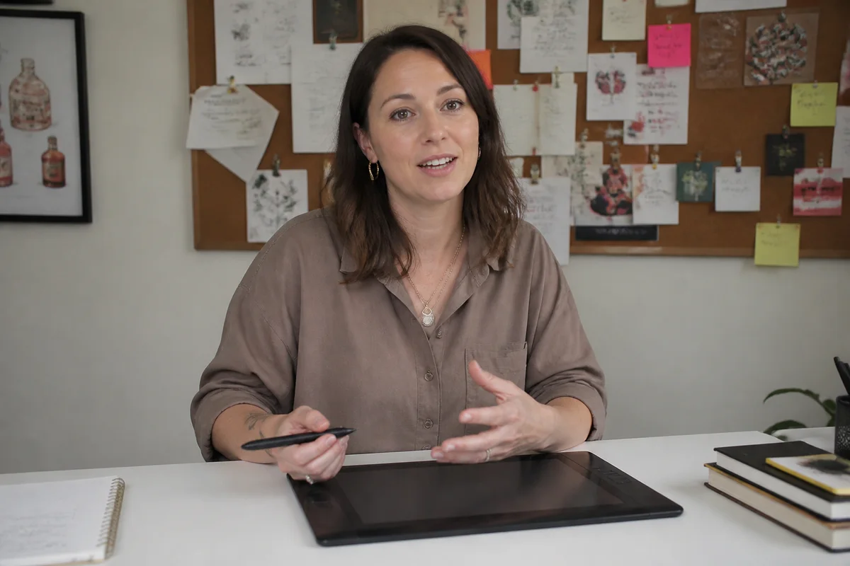
The process shown live — slide the handle to compare.
Online courses are trust purchases: students pay up front for expertise they can't sample, so every visual — the instructor photo, the course card, the sales-page imagery — is being read as evidence of quality. A blurry webcam portrait on a $500 course creates a contradiction the copy can't argue away.
Make the visuals match the price: a sharp, well-lit instructor portrait that reads authority-with-warmth, course-card images that stand out in marketplace grids, and sales-page visuals with consistent, deliberate styling. Each edit takes seconds, and enrollment pages are exactly where small credibility gains turn directly into revenue.
The problems this solves
- A webcam-grade instructor photo undercuts a premium course price.
- Course cards compete in marketplace grids against professionally designed covers.
- Sales pages assembled from mixed imagery read as low-effort — a fatal signal for education.
- Every launch needs fresh promo assets on a solo-creator timeline.
A workflow that works
Build the instructor portrait
Students enroll with a person — the portrait is the credibility anchor of the entire funnel.
AI Professional HeadshotDesign the course-card image
A clean subject on a deliberate background survives marketplace-grid shrinkage better than any collage.
AI Background ChangerLight the promo shots
Well-lit workspace and teaching shots make the learning experience look premium before a single lesson plays.
AI Lighting ChangerGrade the page consistently
One color language across the sales page reads as a designed product, not a stitched-together one.
AI Color CorrectionSharpen for every placement
Cards, ads, and page heroes all render at different sizes — crispness has to survive them all.
AI Image SharpenerFrequently asked questions
Does the instructor photo really move enrollments?
It's the single most-viewed image in the funnel — on the card, the page, and the emails. Students are deciding whether to trust you with hours of their life; the portrait carries that decision.
Can I build launch assets without a designer?
The image layer, yes — portrait, card, and page visuals are all seconds-per-edit jobs in the browser, whenever launch week demands them.
What makes a course card stand out in a grid?
One clear subject, high contrast, and readable simplicity at thumbnail size — the same rules as any grid, applied to your cover.
What's free?
4 credits at signup — the portrait and card cover your launch's two most-seen images.
Related use cases